Press release: Daden release results of it Data Visualisation and Visual Analytics Survey
- Excel still dominates the data visualization field, despite lack of full-featured 3D tools
- Almost 50 percent of respondents have never used a system which plots data in 3D
- About 40 percent of respondents “never” want to use avatars
Birmingham UK — Daden Ltd. released the results of a data visualisation and visual analytics survey today. Daden created this survey as part of the development of their new ground-breaking data visualisation tool, Datascape. The aim was to understand what applications analysts were already using, what they did and didn’t like about them and what people might want to see in a 3D visual analytics application.
The first set of questions concentrated on trying to find out what people are using as visual analytics tools, and not surprisingly Excel dominated out of the choice of applications listed, but the relatively high use of R confirmed its position as a tool-set of choice for those involved with serious analytics. Other applications to score high included Tableau, Spotfire and QlikView.
Beyond the simpler tasks, responses showed that existing tools are not doing the greatest job in the more novel areas such as geo-temporal display, animation or network based analysis., with less than 40 percent of respondents scoring these areas as good or excellent.
Nearly 50 percent said that they never used a system which plots data in 3D and only 10 percent said that were using a 3D system on a regular basis. Excel came out top as the most used 3D system, even though it does not plot in proper 3D.

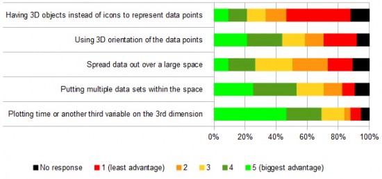
Unsurprisingly being able to use the 3rd dimension to plot another variable received the highest rating for the main advantage of 3D in a user’s experience. And top features requested to available within the 3D application were:
- easy of use
- import from different databases
- ability to integrate with other 2D applications
- web accessible
- time scrubbing/filtering

“The aim of the survey was to understand current use of, and views on, visual analytics tools,” said David Burden, Daden’s managing director. “ The feedback has been excellent and it has given us useful insight into the state of the data visualisation market, as seen from the user perspective.â€
“Interestingly, over 50 percent of people were dealing with databases of less than 1 millions records, so while big data may be the concern of some, a lot of people are still talking about more manageable numbers, and around 70 percent of the respondents were looking to plot around 10,000 points or fewer,†Burden said.
The survey has given Daden a good understanding of the current market and what users actually want from a 3D visualization tool. With Datascape, Daden certainly addresses the lack of tools with good 3D features. Daden hopes to run the survey again in 2013.
The survey results can be downloaded from Daden’s website here.
About Daden
Daden Limited is an immersive learning and visualization solution provider. Daden enables clients to use innovative new technologies to deliver real business benefit, whether that is through more efficient and effective training or using immersive visual analytics to make better decisions. Daden has been working with immersive worlds and artificial intelligence technologies for over 10 years, and clients include government departments and agencies, city and local councils, educators and health providers and private sector organisations in the UK and abroad. The company is based in Birmingham, England.
About Datascape
Datascape provides an easy to use, install and manage immersive 3D environment in which users can visualize and interact with data from almost any source, from financial Excel spreadsheets to live social media feeds. The 3D environment significantly increases the amount of information that can be sensibly displayed, and the sense of immersion provide spatial cues which assist in maintaining orientation and identifying trends, clusters and anomalies with the data. Datascape is designed to maximize human analysis by optimizing the display of data, whether structured or unstructured, enabling the user to take up a wide variety of viewpoints from both inside and outside the data. Datascape is also available in a collaborative edition, which allows users to invite others into their data visualization so that analysis and communication can become a shared task. The net result is better understanding, analysis and decision making, and improved recall.
- Major companies to discuss metaverse plans at December conference - August 22, 2023
- OpenSim Community Conference starts today - December 11, 2021
- Ninth Annual OpenSimulator Community Conference set for December - October 18, 2021
