There’s a well used adage, “sex sells.†It’s a bit of a cliche but true. There are many other sales triggers of course, including fear — used a lot by insurance companies, hope — used by lotteries, and vanity — used by beauty and cosmetics firms.
The list is endless. However, they all have one thing in common – desire. A desire to be beautiful, or to win money, or to rid yourself of fear or guilt or worry.
Effectively tapping into the buyer’s sales trigger will make them want to buy your product.
So, regardless of what you are selling, you need to create desire.
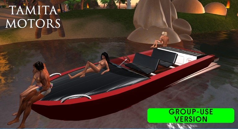
In virtual worlds, a good merchant achieves that through their product box. Your box should tell a story – it should make the prospective customer want to be like the person on the box, or to live in the house that’s on the box. It shouldn’t just be a picture of the product with a price.
Sure, it’s a bit of mucking around taking photos for boxes, but your sales will be exponentially higher if you put a bit of thought into your photo shoot, lighting, fonts, and box design.
Here are some tips:
1. Create the perfect setting
Find somewhere with a nice backdrop that’s appropriate for your product.
If you’re selling barns, rez one on a parcel of land and put some animals about, a tractor, and so on. Create a dream scene that will make the prospective customer want to live there.
2. Set the mood
Use your sky and water settings to create a mood that suits your product.
Nice blue skies with a random scattering of sunset cloud always look good.
If you have several versions of the product, freeze the time of day for the duration of the photo shoot so that the range looks consistent;
3. Shine a light on the model
If the picture centers on a person, front light them so it highlights the person and softens any shadows.
Experiment by having the light higher or lower.
4. Choose an appropriate pose
Again, if the focus is a person, use an animation overrider with evocative – not to be confused with provocative – poses.
Evoke a mood the average person can relate to, but don’t try to force them to feel a way in which they might be uncomfortable.
For example, not everyone will be enticed by a slutty pose on a lingerie box. Some will be put off by it. A romantic pose is safer.
5. Simplify the text
Choose fonts that convey the same mood.
For any words that need to be read easily, use a plain font in white or black. Atlanta, Tahoma or Calibri are good for that purpose. Experiment with bold and light fonts.
Don’t use heaps of words. The picture should tell 90% of the story, not the text.
And speaking of typography — try to avoid fonts that people hate on sight due to over-use, such as Arial, Verdana, and Comic Sans. The latter one particularly looks dreadful on anything. If you put a store name on your box, keep it consistent across your entire product range and shop signs.
Finally, it’s up to you whether to put prices on boxes but personally I think prices look a bit tacky. Also, you may regret them if you later decide to sell your product on another grid that uses a different currency, and you didn’t save the original Photoshop file. (Yes, I mean me!)
- 5 tips for competitive analysis - May 23, 2015
- 5 tips to spark desire for your products - May 16, 2015