OpenSim grid owners are busy people and, sometimes, the website is an afterthought.
Many grids simply go with the default website created by the Diva Distro or New World Studio, which is usually the grid stats, an image, and links for creating accounts. In fact, you don’t need to have a website at all if you have a grid, and there are a couple grids that don’t.
Both of these options tell me that the grid isn’t focused on marketing, or don’t need to attract new users. School grids, or group-owned roleplaying grids, for example, might not need or want an influx of new users.
But there’s something special about a grid that makes the effort to create a really nice website.
The following are some of my favorite sites, in no particular order. Click on the images to visit the sites themselves.
FrancoGrid
This is a French-language, non-profit grid with a unique and minimalist design on its home page.
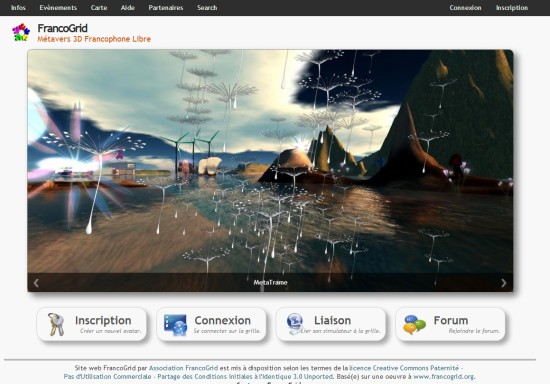
The center images rotate through a gallery of amazing snapshots that illustrate the creativity available on the grid.
Big, obvious buttons at the bottom make it easy to register, login, connect a region to the grid, or visit the forum, with more links in the menu bar up top for events, map, help, partners, and search. The home page is kept clear of statistics, which are easily accessed via the “Infos” link in the top menu.
Even though the design is minimalist, is uses all the space available to maximum effect. The gorgeous images are particularly powerful in this layout. They’re big enough to really have an impact, and the rest of the site is low-key so it doesn’t distract from the snapshots.
My only concerns about this site is that the donate button is buried below the fold — visitors have to scroll down to see it, which could hurt donations — and that most of the images chosen, while beautiful, are devoid of people, making the grid feel like a lonely place. In addition, the keys icon next to the Register button — “Inscription” — could be a bit more colorful, to attract attention to it, since getting new users to sign up is probably the top focus of the website.
Virtual RP
I don’t usually like designs that have white text on a black background, since they are harder to read, but I make an exception for this grid because the decision works.
I also normally recommend against using several different colors on one page. It usually looks better with just one main accent color. But, again, this particular design makes it work. It helps that the colors are well coordinated, and the black background helps pull everything together.

This is a small French-language roleplaying grid, with just 16 regions and just over a dozen active players. But the home page looks great, showing that even a small grid can look good on the web.
The light gray text on a dark gray background with a small font is difficult to read however, especially on text-heavy internal pages. And the images chosen, like those on many other websites, are devoid of people.
Miki Kiti Tiki
I’m including this site because it really stands out from other grids.
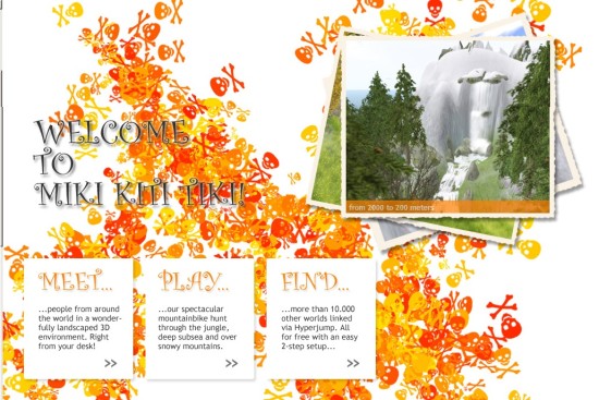
Miki Kiti Tiki is a four-region grid that is just a bike ride trail over mountains and under water. I’ve brought people here to show off OpenSim, however, because the landscapes are gorgeous.
You can see some of them in the images at the top right, which rotate through various scenic spots.
FleepGrid
This is another grid website with a dark background, but the text areas have dark text on a light background, which makes it easy to read.

FleepGrid is actually a personal grid, owned by Chris Collins, who works at the Center for Simulations and Virtual Environments Research at the University of Cincinnati, showing that even a small grid website can be well designed and informative.
The home page includes all the key info, such as the grid’s hypergrid address and the latest news from the grid.
The color scheme and design elements are echoed on the grid itself. The grid is also very useful — FleepGrid is on the hypergrid and is a great place to visit to pick up some education-related freebies.
Avination
This is my favorite of all the big grid websites.

It looks professional and trustworthy, which is a major factor if you’re looking to attract people willing to invest $60 a month for a region on a closed grid.
All the key information is there, without an overload of statistics or technical details. The photo carousel highlights the important features of the grid. And, as an added bonus, most of the images include people.
My only concerns are a lack of contrast between the background image and the site itself, which makes the background a little too distracting. In addition, it’s hard to tell what you’re supposed to do first, as the “Join Now” button at the top left of the image carousel is easy to miss.
Worlds End
This is another small grid with a great website.
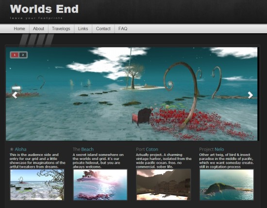
Worlds End is a small creative grid owned by a couple of German artists. It doesn’t look like the site has been updated since early 2012, but it’s a lovely design.
If the goal of a website is to make you want to visit the grid, this site definitely works because I visited the grid right after I saw the site.
The lack of updates is a problem, however, as well as the zero visitors in the last sixty days statistic, which you can see below the fold if you follow the link to the site. I’ve seen some grids showing zero visitors even though there were actually people on the grid, due to a programming error, and that could be the case here as well. My recommendation is to leave that stat off the site until you get it fixed.
The Lost Castle
This is another one-man grid. The home page of the website is basically just a slideshow of photos from the grid.
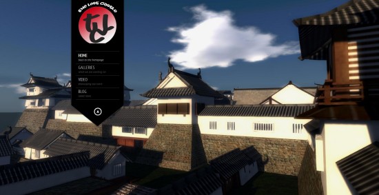
It’s effective, because the grid itself is a showcase for a historic recreation.
The gray text on a black background is a little hard to read, especially with the thin and cursive fonts chosen. But otherwise, it’s a memorable site that stands out whenever I visit it.
JokaydiaGrid
This is an education-oriented grid, one that hasn’t been as active recently as in the past after moving hosting providers.
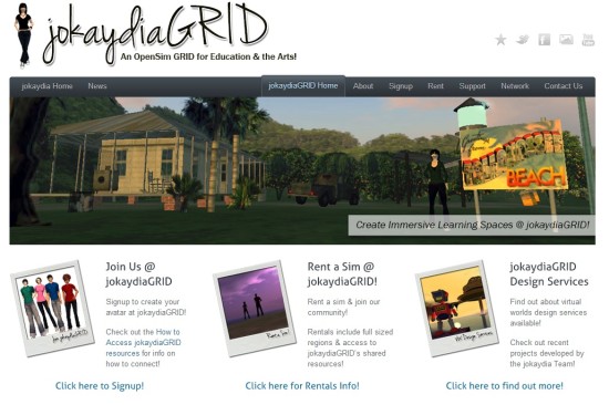
What I like about this website is its casual, personal feel — and the fact that the black-on-white text is easy to read. Â The site is also very focused. Visitors can immediately see that they can sign up for an account, rent a region, or hire JokaydiaGrid to do design work for them.
The selection of photos highlights the different kind of activities and builds available on the grid.
My only quibble is that the three Polaroids are a little too big, and distract attention from the main photo slideshow, which could be a little bit bigger vertically to really give these images the room they deserve.

- Kitely Mega Worlds on sale for $90 per month - July 19, 2024
- OpenSim regions up, actives down with summer heat - July 15, 2024
- People think AIs are conscious. What could this mean for bots in OpenSim? - July 12, 2024