Today, I helped an OpenSim entrepreneur, known to the metaverse as Minethere Always, come up with a visual style for her ads and website, using a super slimmed down version of the branding process that an agency would use. She might decide to go into a totally different direction, which is fine with me, because the process itself makes for a useful illustrate exercise for anyone looking to improve their visual marketing.
Pick your primary color
Have you ever gone into a store, picked out something that catches your eye, brought it home, and discovered that it doesn’t go with anything else you own? I do that all the time. Finally, I just decided to stick with black for almost everything, and then have accent pieces, like blouses, in bright jewel colors, like a dark ruby red. Now, I can even get dressed in the dark and will look presentable.
That’s the same approach I recommend for visual design. Pick your one key color, and do everything else in black and white — or very very close to black and white.
Now, the big companies hire expensive color consultants to figure out what their main color should be. Let them do that. Then, you can just swoop in at the end and take advantage of all their big-budget research.
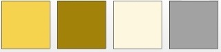
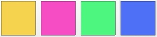
Start by taking a look at the color logo chart below. Where would your company be on this chart? By picking a color, you’re not only creating an emotional mood for your customers, but also subtly reminding them of other brands that share the same color.

I, for example, am anything but peaceful. I definitely see myself in the “bold” category, and my main color is a slightly dark shade of red.
Minethere Always identified more with the bright yellow, optimistic and warm brands. So that was our starting point.
Plus, a quick Google search for yellow logos led us to a couple of websites that used that color in a really effective way, including Yellow Pages and Nikon.
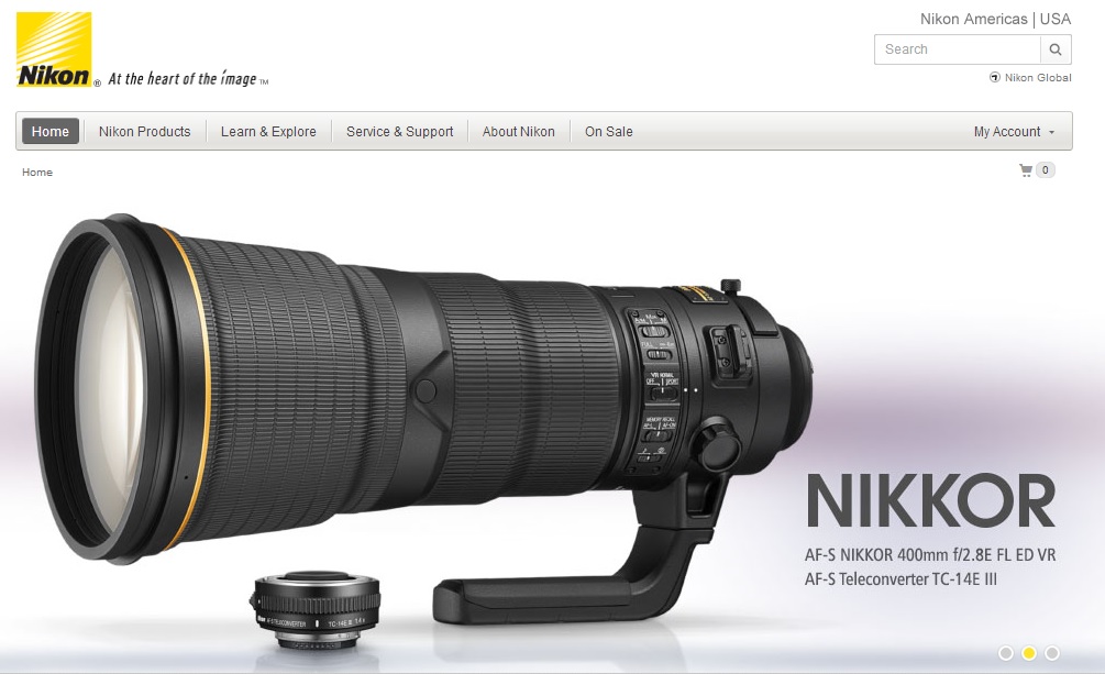
The yellow color is also used throughout the site on buttons, headings, and icons.
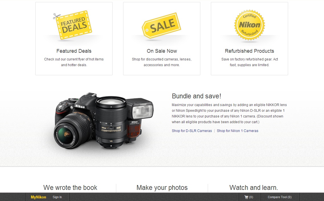
Aside from the yellow accent color, the rest of Nikon’s site is almost all black, white, and shades of gray, allowing the images of its products to really pop off the page.
In fact, most shopping sites have a similar approach to their design. They’ve spent a lot of money on figuring out what works, and what works is when the design of the site doesn’t distract away from the stuff you’re trying to sell.
Meanwhile, take a look at Minethere Always’ current landing page — reproduced here with her permission:
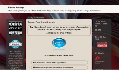
There’s a lot of different colors there. A few shades of purple, some reds, blues — and there used to be a lot more before she simplified. Plus lots of distractions in the sidebars to take the focus away from the main point of this particular page — to sell terrains for $5 each.
Create a palette
If your color is bright blue or red, all you need to complete your palette is darker and lighter versions of the same color. You can use your key color for links, for example, and the darker version of the color when you mouse over the link. And you can use a lighter version of the color for backgrounds on boxes — the lighter the color, the bigger the box you can have.
A good, free online tool for turning a single color into a whole set of is Colors on the Web.
Another nice site for generating a color theme palette is Adobe’s Kuler, which makes it easier to adjust individual colors in the palette by more than a dozen different sliders. I like adjusting by hue, saturation, and brightness, for example which makes it easy to get a lighter or darker version of the same color.
Here’s the same palette run through Kuler and tweaked a little bit:

Some websites that have yellow as their main accent color have a second color for links, since yellow doesn’t show up well on a white background.
Here is a color palette from Colors on the Web, this time using the “tetradic” combination instead of the previous, monochromatic one.
Now, only two more colors are needed to round out the palette — the color for the main text background, and the main text color.
You can’t go wrong with black and white for these. But you can also go with an off-white color — the litest possible shade of your main color that you can still see — or an off-black color, or the darkest share of your main color that you can distinguish from black.
And that’s your color palette. Use it everywhere, until just the colors alone remind customers of your brand.
Choosing fonts
The final stage of your visual identity is picking fonts.
For your main body font on the web, pick a sans-serif font that appeals to you. If you’re using standard Web fonts, that means Arial, Helvetica, Verdana, Tahoma or Trebuchet. If you have Google Fonts installed, Open Sans, Roboto, Ubuntu, PT Sans, Droid Sans, Noto Sans and Source Sans Pro are also good alternatives.
The body font on this site is Ubuntu, and not just because I like the operating system.
For your headings, if you want to switch fonts, a good rule of thumb is to pick a serif font, like Times or Georgia. On Google Fonts, you can also look at Droid Serif, Noto Serif, Vollkorn, Bree Serif,  Sanchez, and Domine.
In print, the opposite is true — you would use a serif font for the body, and a smooth sans serif for the headings.
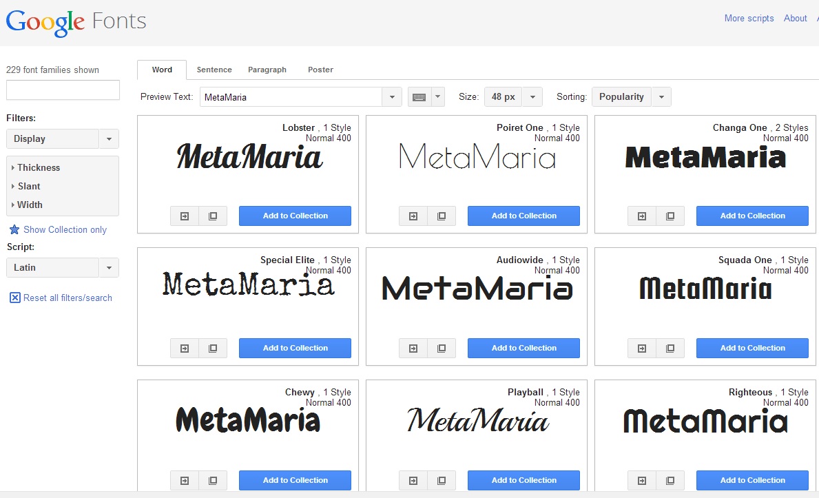
Finally, pick a cute font for your logo font. It can be cursive, like Coca-Cola’s, or futuristic, or completely stylized. Since you’re using in a graphic like a logo, you can use any fonts you’d like, including Google’s entire collection of 635 fonts, or any of the fonts that come with your word processing or graphics programs. Click on the “display” category on Google’s font site for some unusual fonts. You can even type in your own logo text at the top of the page, and see how it will look in any of the fonts.
In the description for each font, Google suggests other fonts that go well with it.
Do not use this fancy font for anything except your logo. All the actual text on your site should be in either your main text font, or in your heading font.
Finally, one last note about styling text — do not use underlines, do not use italics, use bold extremely sparingly. When you do use a special style, like boldface, do it consistently — for all your headings, for example.
The result should be a site that allows your content to shine through, either the information you’re trying to present, or the graphics that go with your products.
Creating the first ad
Currently, the ads on Hyperica are free. So Minethere Always wanted to create an ad that would draw people to her landing page. The ad needed to use her primary color, and be simple and clear enough to stand out and get her message across.
This was the original graphic on Minethere’s Kitely Market store:

The ad below uses Open Sans as the main font, with Segoe Script as the fancy font, carried over from the image above.
The sunset is a public domain photo, colors adjusted to match her color theme. The foreground mountains are just simple cut out shapes.
I set it up as an animated GIF by creating a GIMP image with four text layers and six layers that were just the background. I saved it so that I could edit it later, then merged each of the text layers down with one of the background layers — I alternated the two types of layers then right-clicked on the text layers and chose “Merge Down.” Then I arranged the layers so that the one I wanted to come up first was at the bottom, and exported it as a GIF with “Animation” checked and a 1,000 millisecond delay.
There’s some controversy about which ads work better — animated ones or static ones. I’ve seen reports that say the animated ones do 12 percent better, but for some advertisers, the static ones do better. The answer, of course, is to run both types of ad at the same time and see which one performs better with your customers.
Another approach which might work well with this ad is to have the text be fixed in place, while the sun slowly sets behind it. You know, because time is running out to get the special deal. That’s a little beyond my artistic skill, but Minethere might be able to accomplish it. For example, mentioned actually shooting the visuals for the ad in-world, using an actual island terrain. In that case, she can simply advance the time forward and get actual footage of an in-world sunset.
Then the same images were used to create a new banner for her Kitely Market store.

Brand name
The brand name is only sort of part of the visual identity of a brand, but I want to touch on it for a second anyway.
The ideal brand name should be unique, not a combination of generic worlds.
Say, for example, you offer housekeeping services, and you name your business “Housekeeping Services.” When anyone tries to Google it, lots of other companies offering housekeeping services will come up. Â Calling it something like “Jack’s Housekeeping Services” differentiates it from the other companies out there.
That isn’t a problem for Minethere, for now at least, because she dominates the first page of search results for “region creations.” This may change, however, as more people go into the region creation business.
Finally, I want to thank Minethere for being a good sport about all of this! It can’t be fun having someone critique your site, your brand and your advertisements and make you redo them over and over and over again!

- OSgrid back online after extended maintenance - April 16, 2025
- Analysts predict drop in headset sales this year - March 25, 2025
- OSgrid enters immediate long-term maintenance - March 5, 2025