Since I last checked out grid-worthy WordPress themes, many more gorgeous, free, responsive themes have hit the market.
Here’s a roundup of a few I’ve collected, thinking, “Wow, this would make a great grid website!” because they have a strong focus on images.
These themes illustrate some of the other things I also look for in a grid website:
- Responsive. That means that it resizes automatically for different devices. These days, that’s a must!
- Clear call to action. It should be instantly clear to the visitor what they’re expected to do — register for a free account, for example.
- Easy-to-find core links. Grid calendars. Land purchase pages. Information about the grid. The must-have things should be super easy to get to.
- Not too fancy. Virtual worlds should definitely be at the cutting edge of technology — including Website design technology. But getting too far on the cutting edge with bells and whistles just gets in the way of the core message. I prefer using stuff that’s new, but well-tested and customer-approved.
Starter: A one-page theme
You might have seen these one-page themes popping up everywhere. I’ve particularly been seeing a lot of them used by virtual reality startups.
The Starter theme is a beautiful, clean way to set up a one-page site. There’s also a blog attached, for your news posts. So it’s really like two themes in one.
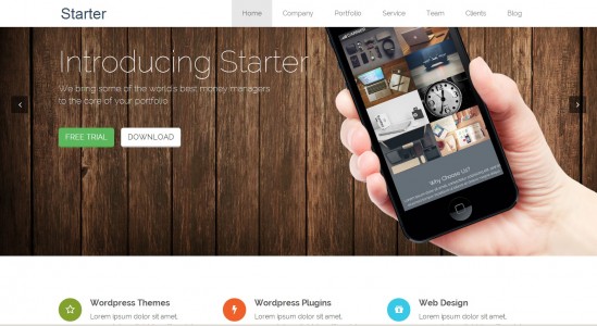
Check out the Starter demo here — be sure to click on the “Blog” link at the top right to see what the theme’s blog looks like. Then download the theme here for free.
Parallax: Featuring the cool new parallax effect
Another new trend I’ve been seeing is the use of parallax scrolling. It creates a very modern and elegant effect.
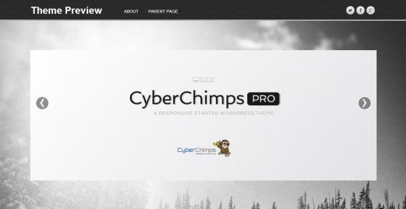
I’m not sure yet whether this will catch on or not or if parallax is just the latest design gimmick, but if you’re offering virtual world consulting services, for example, this is a great way to set yourself apart from the competition.
Preview and download this theme here.
Adament: A full-screen theme that can really show off your grid
I’ve mentioned before that I’m a huge fan of grid websites that have a picture that takes up the full screen.  The Lost Castle has one and it’s stunning. AviWorlds has an image slider that’s almost full-screen — just a little room on the bottom for key features, and a clear call-to-action right in the middle of the screen. The SimValley site is very dramatic — though I would prefer to see more high-quality images from their grid instead of stock photos.
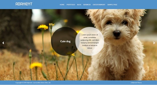
The Adament theme, above, is all about the graphics, with a full-screen slider. I don’t know how I feel about those animated circles, though. One problem with this theme, is that it’s licensed for non-commercial use, and I couldn’t find any details at all on the website for how to get a commercial license. For non-profit, educational, community and personal grids, of course, this would be a non-issue.
Explore the theme demo here. Down the theme here for free for non-commercial use.
Shuttershot: Another full-screen non-commercial theme
This theme is from the same company, but without those animated circles and with a slightly different style.
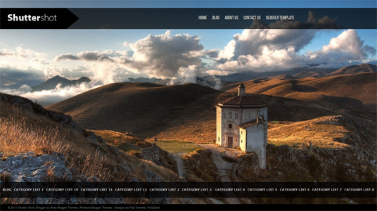
Again, the theme is free only for non-commercial use. View the demo here. Download the theme here.
Sunrise: A different take on full-screen
Here, the main marketing message is front and center — but the three calls-to-action are buried below the fold.
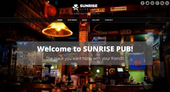
I can see this theme being used for a community or event grid such as Nara’s Nook — though not them, specifically, because their current website is gorgeous.
The Sunrise theme also has a cute visual effect — as you scroll down, the main background image stays in place.
See the theme demo here. Download it here.
SDK Fullsize: Maximize your photo impact
This theme is a lot like the one used by The Lost Castle grid, except with the addition of the text overlay on the bottom right.
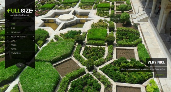
I am not a big fan of this theme’s internal style, which is gray text on a black background. Oh, my eyes, my eyes! But it would work for a science fiction-themed grid or a grid hoping to attract young male users with good eyesight. Or for a grid willing to edit some CSS.
See the theme’s demo here. Download it here.
WP Advocate: Three calls to action
I like the changing background picture on this theme, and the three call-to-action boxes — I can see a grid using them for registering new users, and selling land and in-world currency, for example.
According to the theme’s description, the theme is specifically designed to highlight the people working at a company — and the people page was, in fact, my favorite part of the demo. That would make this a good theme for a design studio, or for a grid founded by a team of people who are all very involved in running the grid.
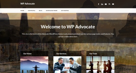
My only complaint is that the home page uses a little bit too much space — the calls to action get cut off by the fold, so people have to scroll down. I might make them a little smaller, so that they’d fit without scrolling.
See the theme demo here. Download the theme here for free.
Pictorico: A carousel of images
I really like this theme’s main image slider, and the way interior posts really highlight those images. The home page also has a gallery below the fold.
This is a good theme for a grid looking to highlight its creative builds, or a designer showcasing a portfolio.
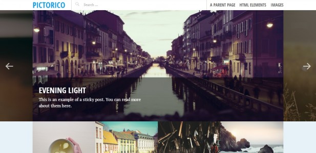
See a demo of this theme here. Download the theme here for free.
Asteria Lite: A blog and portfolio
If you scroll down Asteria’s home page, you’ll see four calls to action, and a photo portfolio. The theme automatically organizes photos into beautiful, interactive galleries, and has a full blog section as well.
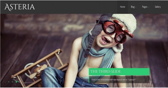
The slider on the home page offers a variety of text styles for the overlay.
See a demo here. Download the theme here.
Sparkling: A modern, flat theme
Another current trend is flat design — elements are placed on a page without shadows or other 3D-style effects. It’s a clean, modern look, and a great example of it is the Sparkling theme.
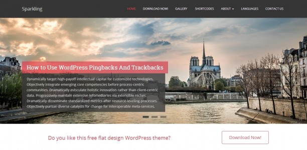
This theme also has a nice, clear call-to-action right above the fold. And, unlike most of the other themes in today’s list, this theme puts recent posts below the fold, useful for a grid or service company that has a handful of articles to feature but doesn’t want them to distract from the main call to action.
See the theme demo. Download the theme now.
Vision: For the grid with great events
I know I said ten themes in the headline, and I was planning to do just ten themes, but then had to squeeze one more in.
The Vision theme is another example of flat design, and latest blog posts below the fold on the home page. Instead of “hello world!” on the home page, of course, I’d put the key call to action — such as “Get your free avatar now!”
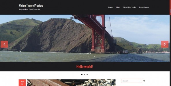
My favorite part is the large photos that go with the latest posts — scroll down through the demo to see them. I can see a grid using these to post write-ups of events, for example.
See the demo here. Download the theme here.

- OSgrid back online after extended maintenance - April 16, 2025
- Analysts predict drop in headset sales this year - March 25, 2025
- OSgrid enters immediate long-term maintenance - March 5, 2025