In response to yesterday’s post about the changing editorial direction at Hypergrid Business — and free ads — I’ve been flooded with requests for advertisements.
And I want to run the ads. Really, I do. Promoting OpenSim to the 100,000-plus site visitors who might not have heard of OpenSim before but are coming here for VR news is a good thing. These are all potential customers who can help grow our community.
But folks, you gotta give people a reason to click on the link. Otherwise, the ad is just a waste of real estate.
Here’s an example of the kind of ads that I’m getting (not actual ad):
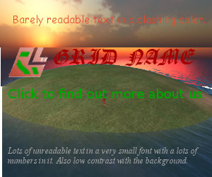
Okay, here are the problems:
- Distracting background. There’s an island, a sea, a sunset… Lots of different colors. Folks, please make the background simple so it doesn’t take away from the main message of the ad!
- Lots of different colors and fonts. The logo, the main title, the pieces of text are all different from one another. It creates an incoherent mess. Pick just one font and style and stick with it.
- Low contrast. Your ad needs to have either really light text on a really dark background, or really dark text on a really light background. Otherwise, nobody will be able to read it.
- No reason to click. This is a huge one. Why would anyone want to click on ad that’s just your company name? Or that says “click to find out about us?” That’s what you want them to do — it’s not what they want to do. You want to give people an actual, real reason to click the ad and go to your webpage.
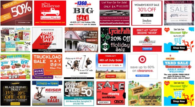
Go to Google and search for ad images that are 300 by 250 pixels. Which ones jump out at you?
Most likely, you were attracted to ads that had bright colors, bold messages, one compelling graphic — or no graphic at all.
Here’s the kind of ad I’m talking about:

You’ve got the special offer — the discount. You’ve got the call-to-action — the “Shop Now” button. And the graphic element clearly illustrates what the company offers. Fruit.
Here’s another example of an ad that jumped out at me:

The text is light, on a solid dark background, so it stands out well. There’s a nice, red, call-to-action button that is just screaming for you to click on it. Who can resist pushing a big red button? And, again, the graphic image is clear and illustrates what the company offers.
I can easily see this kind of ad being used as a model for a region rental ad, or an ad for free parcels with starter homes. Â An ad promoting low region prices and no setup fees could also be effective, as well, especially if it compares the regions directly to Second Life regions.
Plus, I’m fine with animated GIF ads. So if you have a message that needs more space, feel free to create an animated GIF. There are several free tools online, though I just use GIMP.

The ad above, for example, uses a subtle animation to draw attention to the special offer. The animation effect could also be used to just have the text change, or have a butterfly flutter across the image.
Or you can use GIFs to create a slide show. For example, you can have an ad that showcases different destinations on your grid, or different items for sale in a store.
To easily create a GIF if you don’t want to learn GIMP, just create some images with any image editing or drawing tool you like, each 300 pixels wide by 250 high, one for each slide in the slideshow or animation. Then upload them to a free GIF maker, such as EZGIF, Giphy, or ImgFlip.
What to offer?
You know what you want from people. You want their attention, or you want their money, or you want them to attend some event. But what do those people want from you?
Put yourself in their place. What would get you to click on an ad?
Be honest. You think you hate those come-on, limited-time-offer ads. But you still click on them, especially if the thing being offered is made to look really enticing. A $2 off coupon on a big, juicy hamburger. An opportunity to fight for a cause you believe in. The promise of a really funny cat video.
What can you offer to potential customers that will entice them to click?
Can you offer them a discount on hosting? A beautiful free home on your new grid? A chance to check out the new spring fashions? A subscription to a newsletter or community about all the best hypergrid events? A free pass to a fashion show? A how-to booklet for organizing successful virtual events? A “virtual vacation” for Valentine’s Day? A free lesbian vampire avatar on your lesbian vampire grid?
Here are some more ideas:Â 10 marketing cliches that still work just fine,
Calls-to-action
The call-to-action comes right out of the special offer. It should be super-simple, and super-clear and make it obvious that you want people to click on something. A little button in your ad is really good for this, it helps the reader get the idea that they’re supposed to click.
Some ideas:
- Buy now
- Click to subscribe
- Visit us in-world!
- Get your free parcel now!
- Compare our prices
- Become a vampire!
Growing the pie
Remember that the end goal here is to attract non-OpenSim users to OpenSim. The 100,000 people who come here for VR stuff, who are interested in technology and in immersive environments — these are all potential customers for your grid or product.
What would attract them to OpenSim?
Maybe they would like to learn how to build in 3D. Or the idea of creating a virtual environment that they can visit in VR appeals to them.
What first attracted you to OpenSim, and to virtual worlds in general? The limitless possibilities? A particular social community or role playing group? The gambling? The fashions? The educational opportunities? The virtual prototyping? Figure out how to package it all up in an ad.
Then email me the image, or a link to where your image is located, and the URL to send people to when they click. The image should be 300 pixels wide by 250 high, in either JPG or GIF format. My email is maria@hypergridbusiness.com.

- Kitely Mega Worlds on sale for $90 per month - July 19, 2024
- OpenSim regions up, actives down with summer heat - July 15, 2024
- People think AIs are conscious. What could this mean for bots in OpenSim? - July 12, 2024