The power of first impressions is either ignored or overlooked. Perhaps the poor state of design in Second Life is due to myopia—no one can see his or her own face objectively.
A stroll around the Aloft group in Nonprofit Commons is a lesson in visual frustration. (Because the 30 organizations there comprise about a third of all nonprofit residents, I hope the other groups fair better in my upcoming analysis.)
Many have beautiful architecture and interior design. But the signage, the information, and the communicative power of graphic presentation is virtually ignored! This is so surprising when the resources for space and furnishing is a major effort (albeit a cheap one). Here is what I found so far:
Graphics at 30 Nonprofit Commons Aloft organizations
Placement of signs is better than the average Second Life presentations. For 23 of the organizations, isn’t too difficult to tell who is who, though camera work is necessary when the signs are placed too high. The most legible use several sign positions—outside of building, near the entrance, just inside, and prominent in every room. Redundancy is important. The most astute also place a sign on the roof of their buildings so that it can be found from the air.
Legibility is poor. Fully half of all the signs are difficult to read. Because the point of a sign is to be read, such oversight is hard to understand. Editing can be difficult for anyone wishing to tell a story. But the rules of visual seduction, brevity, and even composition are still necessary. Residents put hours of work into avatars to represent them with sophistication, yet make presentations that are difficult to comprehend! It makes me wonder both why they are there and what kinds of responses they have garnered. This is not to say that compelling signs will guarantee that marketing goals will be met, but there is a certainty that meeting them will be more difficult if communications are unsatisfying.
Images are crude. Three quarters use images from logos to illustrations to photographs. But unfortunately, less than half of those look amateurish. (If I investigate the websites of the same organizations, I wonder if I will find the same thing?) The best use the organizational logo, furthering identity recognition.
Poor informations signs. Those groups that have signs inside their spaces either overwhelm the visitor with too much or underwhelm with vague content. Most have publication offerings, links to websites and blogs, and videos of activities. How these are presented seems more of an after-thought rather than as strategic tools.
The honeymoon is over. Two organizations are gone. The others discuss concerns in the Friday morning conference. Having attended, it is a challenge are to be taken seriously in the business community. The novelty has worn off and expectations altered. Second Life’s role is now being defined for fundraising, presentations, education, and publications. It is a more direct form of communication with members that the belief in its future holds strong. But the idea of foot traffic is dashed. Instead, being event driven, what you put in is what you get out; it is no panacea.
Graphics role models
Three are the best. They are worth visiting as examples of what to do right. I will review these three in more depth and investigate the components. For now, effective graphics are most used by:

The AAUW (American Association of University Women) hits all the bases with outside and inside signage. Although not very imaginative, their communication is clear, crisp, identifiable and inspiring.
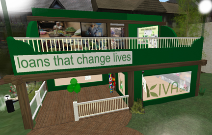
KIVA: Loans that Change Lives demonstrates a corporate design approach very effectively. Every view reinforces their identity and the viewer is never lost.

PROJECT JASON: Assistance for Families of the Missing has a mysterious name so graphics become even more important to communicate mission. Very compelling in their portrayal of finding missing children, the visitor gets swept into awareness.
The more a viewer becomes engaged during a visit, the more inclined he or she is to drop a donation in the tip jar on the way out. The fundraising aspect of Second Life has only begun to be tapped. A much wider-reaching audience can augment the real life performance of these organizations. Graphics have a major role to play in compelling that audience to action.
- No Excuses for Poor Signage - February 4, 2011
- Virtual designs lack graphical appeal - November 2, 2010