Zetamex, the second highest-rated OpenSim hosting company, has been repeatedly criticized for changing things up too much — price plans, offerings, management panels, even CEOs — all have changed repeatedly in the past few months, leaving users struggling to keep up.
Some of the changes have been for the better, others for the worse, but the additive effect has been simple confusion. CEO Timothy Rogers promised to reform his change-loving ways when he temporarily stopped accepting new customers exactly two months ago.
Now the Zetamex website is back up, and — yup, there are changes.
But before I go into the design itself, I have to point out that nothing on the site works yet. They’ve launched with an unfinished product.
There is no reason for a company — especially a tech company — to launch a half-finished website. This is what development servers are for. You develop off-line, test everything, run it past a copy editor and your grandma, and then you hit the button and make it go live.
I understand that sometimes things happen and sites go down, or unfinished sites go live. Zetamex, though, seems to make a habit of launching prematurely.
Old site versus new site
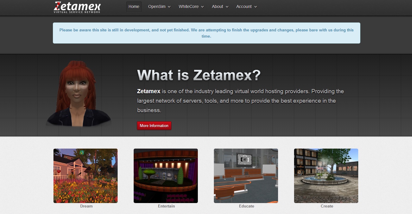
My take on the site redesign at the time: “Looks very friendly and approachable, simple and clear pricing plans — very nice job!”
I would still have some minor quibbles — I wouldn’t be an editor if I didn’t. But, for the most part, I though the redesign was a great job, and made the company’s website look like a real site. Plus, they fixed most of the issues I pointed out in my previous review.
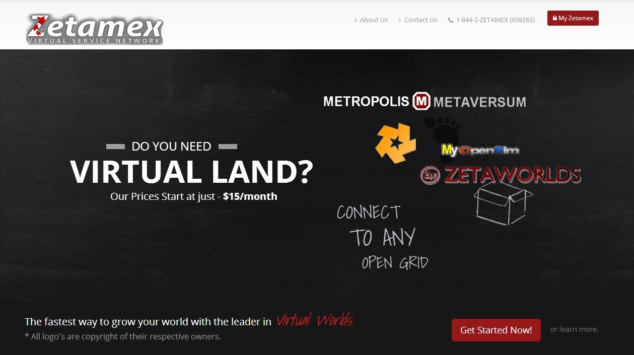
The new design has one of those really long home pages where you scroll down through things. Plus, the main image — the black rectangle above — is all animated. The worlds move around, a chalk drawing of a cloud shows up. It’s messy, there’s too many different fonts. It’s still better than the design they had at the beginning of the summer, but I wouldn’t consider it to be a better design than the previous one.
Plus, radical redesigns are worth it when the old design is obsolete. Maybe it looks amateurish, or is several years out of date, or just doesn’t do its job. But when you have a working design — as Zetamex did with its previous one — then the best strategy is incremental, well-tested improvements. Dramatic and unnecessary changes will actually cost you customers.
In particular, this redesign went from a more-or-less clear and straightforward website to a confusing and unclear one.
Zetamex hosts regions, and it hosts grids. Ideally, the Zetamex website should be able to sell land to anyone who shows up. If you didn’t know about OpenSim, didn’t know what Metropolis was, or what the OSgrid logo was, or what an “open grid” was — would you have any idea of what Zetamex offers?
If I were a hosting company, here is what I would put on my home page:
- Create your own virtual world: no programming required, Second Life-style building tools, ready for the Oculus Rift
- Rent land on existing virtual worlds: biggest choice of worlds, free starting regions, full access to hypergrid and Kitely Market
And I’d have illustrations that show the free starting regions, so it’s super clear what I’m offering. After all, the word “virtual” can mean a lot of different things to different people.
Back to the Zetamex home page. I scroll down, and the confusion grows.
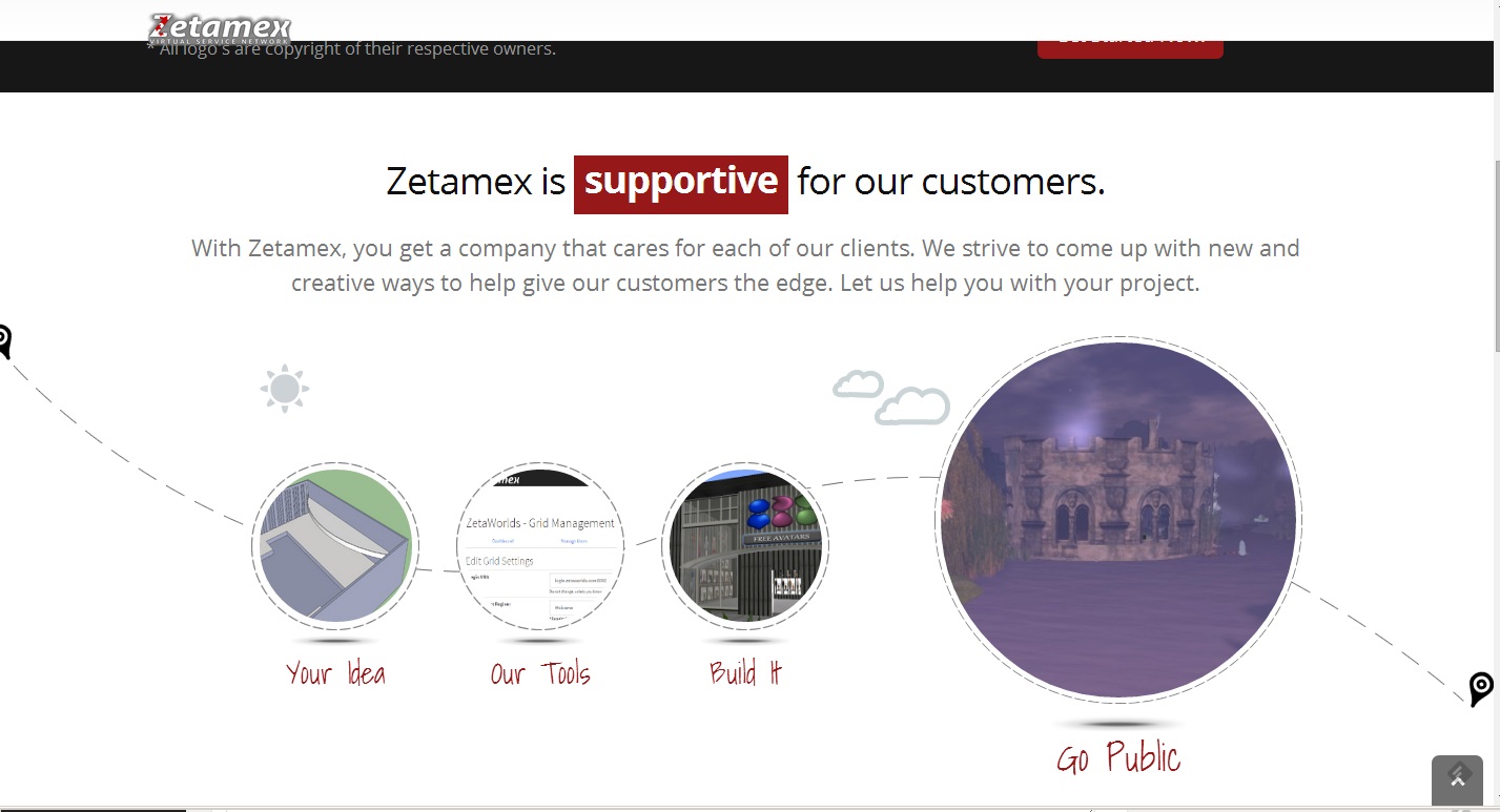
Putting aside the grammar mistake in the headline, the descriptive text sounds like it’s for an advertising company, or a software development company, or an engineering company, or even a legal or accounting firm: “With Zetamex, you get a company that cares for each of our clients. We strive to come up with new and creative ways to help give our customers the edge. Let us help you with your project.”
It’s vague, and the images chosen to illustrate this vagueness are also very vague.
It does get a little better further down, though. There’s a section that lists the features that they offer, though, for some reason, they’ve put “forkable projects” above “toll free phone support” and “we give back to non-profit grids.”
Scrolling further still, you get to the fact that they have servers around the globe — but without an explanation of how this benefits customers by providing them with faster access to their worlds.
And, almost at the very bottom — customer testimonials! Customer testimonials are great for showing that a company is credible, but Zetamex undercuts this by using cartoon avatars instead of real photos, of the customers quoted. Especially if they’re trying to go after corporate clients, customer testimonials need to be as professional as possible.

- OSgrid back online after extended maintenance - April 16, 2025
- Analysts predict drop in headset sales this year - March 25, 2025
- OSgrid enters immediate long-term maintenance - March 5, 2025